· Athlure Specialist · website speed · 10 min read
Landing Page Optimization: Structuring content to maximize conversions
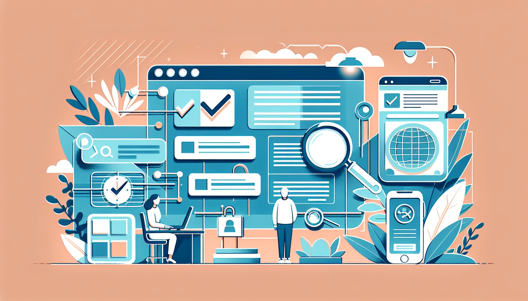
Learn about Landing Page Optimization and Structuring content to maximize conversions in simple, easy-to-follow steps. Get practical tips to improve your website.

Did you know that a good landing page can make people want to buy what you’re selling or sign up for what you’re offering? It’s like when you see a really cool poster for a movie. If the poster is great, you’ll want to watch the movie. That’s what we want your landing page to do – grab people’s attention and make them want to stay.
Landing Page Optimization is important because it helps make sure that when people visit your page, they find what they’re looking for and want to take the next step, like buying your product or joining your email list. It’s like making sure your lemonade stand looks inviting and fun, so people will stop by and want to try your lemonade.
In this blog post, we’ll talk about how to make your landing page really work for you. We’ll show you how to arrange your words, pictures, and buttons in a way that makes visitors want to take action. Think of it as setting up your lemonade stand in the best spot in the park, where everyone can see it and wants to come over.
You’ll learn simple tips to make your page better, like where to put the most important information and how to make your buttons really stand out. We won’t use hard words or complicated ideas. By the end, you’ll know just what to do to make your landing page one that people can’t resist. Let’s turn those visitors into fans and customers!
Quick Navigation:
Understanding Your Audience
When making a landing page, it’s like throwing a party. You need to know who’s coming, so you can have their favorite snacks and music. That’s what understanding your audience means. You need to figure out what your visitors like and need. Then, you make your page feel like it’s just for them.
Identifying Customer Pain Points
Think about when you have a problem, like when you can’t open a jar. It’s frustrating, right? Well, your customers have problems too. These are called pain points. Here’s how you find out what bothers them:
- Listen to them. Maybe they talk about it on social media or in reviews.
- Ask them. You can send a survey or ask them directly.
- Watch what they do. Sometimes, what they do on your website shows you what’s not working for them.
Once you know their problems, you can show them how your thing, like a super jar opener, can help.
Tailoring Your Message
Now that you know what’s bugging your visitors, it’s time to talk to them in a way they understand and like. Here’s what you do:
- Use words they use. If they say “cool,” you say “cool.” If they say “fantastic,” you say “fantastic.”
- Show you get it. Tell a story about someone who had the same problem and how your thing fixed it.
- Be friendly. Write like you’re talking to a friend, not giving a science lecture.
Here are some quick tips to make your message just right:
- Keep it simple. Big words can confuse people.
- Make it about them. Say “you” a lot.
- Be clear about what you want them to do, like “click here” or “buy now.”
When you talk just right to your visitors, they feel at home on your page. That’s when they start to think about getting your help. Now that you know how to make your visitors feel understood, let’s move on to making your landing page shine with the right design.## The Power of Visual Hierarchy
When you make a lemonade stand poster, you want the big, colorful words “LEMONADE” to be seen first. That’s what visual hierarchy is all about on a website. It’s a way to make sure people look at the most important stuff first, like your big lemonade sign.
Strategic Use of Color and Contrast
- Bright Colors Pop Out: Just like a red stop sign, using bright colors on your website can make important buttons or deals stand out.
- Dark vs. Light: If your page is light, use a dark color for something you want to show off, like a “Buy Now” button. It’s like turning on a flashlight in a dark room – it grabs attention!
Remember, color and contrast are your friends. They help guide people where to look, just like street signs help drivers know where to go.
Layout and the F-Pattern
Imagine reading a book. Your eyes usually start at the top left, slide over to the right, then drop down and repeat. That’s the F-Pattern, and it’s how we often read websites too.
- Top-Left Corner is Key: Put your logo or main message here. It’s like the starting line in a race. Everyone looks there first.
- Horizontal Lines for Important Info: Just like the shelves in a store, the top part of your page should have the stuff you want people to see first. Maybe it’s a sale or a cool new product.
- Side Areas for Extras: The sides are like the pockets of a backpack. They’re good for things you need, but not right away, like a sign-up form or contact info.
By designing your page with the F-Pattern, you’re helping people read your website in a comfy, natural way. It’s like when a teacher arranges desks so everyone can see the board without turning their heads. It just feels right!
So, remember, using colors that stand out and arranging things in an F-shape can really help people see what’s most important on your site. This can make them more likely to buy your lemonade, or whatever great thing you’re selling!
Now that we’ve squeezed out the goodness of visual hierarchy, let’s pour ourselves into the next section where we’ll stir in some sweet tips on crafting the perfect headline.## Crafting a Compelling Headline and Copy
Writing a Headline That Hooks
Your headline is like a door handle. It’s the first thing people touch, and it can decide if they open the door to see what’s inside. You want your headline to be like a shiny handle that’s hard to ignore. Here’s how you make it grab attention:
- Start with a bang: Use powerful words that make people curious.
- Keep it short: Make it like a quick hi-five, not a long handshake.
- Promise something good: Tell folks they’ll learn something cool or find a great deal.
Think about a book title. A good one makes you want to read the book. That’s what your headline should do for your webpage.
Creating Persuasive and Clear Copy
Once they’re on your page, you need to keep visitors there. The words on your page are like a path through a park. You want people to enjoy the walk and see the sights, not get lost. Here’s how you write copy that guides and persuades:
- Keep it simple: Use words that are easy to understand.
- Be clear: Make sure each sentence says exactly what you mean.
- Focus on them: Talk about how your stuff can make life better for your reader.
Imagine you’re explaining your page to a friend. You wouldn’t use big, confusing words, right? Write like that. Here are some tips to make your copy work:
- Use lists: Bullet points can help make your ideas clear and quick to read.
- Short paragraphs: Keep them short and sweet.
- Tell a story: A simple story can show why your thing is so great.
By writing this way, you will help people see why they should care about what you’re offering. And you’ll help them understand why they should act now to get it.
So, as you work on your landing page, remember that your main job is to make things as clear and inviting as possible. Coming up next, we’ll look at how to make your page look great, so that your words and your design work together to get folks excited about what you have to share.## Optimizing Calls-to-Action (CTAs)
Imagine walking into a store looking for a fun board game. You want the game to catch your eye and tell you quickly why it’s the best choice. That’s what a Call-to-Action (CTA) does on a website. It’s like a shiny sign saying, “Click here to have fun!” or “Buy this for a great time!” Let’s learn how to make CTAs easy to find and want to click on.
Designing Effective CTA Buttons
Creating the perfect CTA button is like baking cookies. You want them to look so yummy that everyone can’t wait to try them. Here’s how to make your CTA buttons stand out:
- Use bright colors that look different from the rest of the page. Think of a bright red strawberry on a pile of green leaves.
- Make the words on the button clear and simple. It should be like saying “Play Now!” instead of “Engage in this activity today!”
- The button should be big enough to see easily but not so big it takes over everything.
CTA Placement and Frequency
Putting CTAs on your page is like hiding treasures on a map. You want to lead people to the prize without making it too hard or too easy. Here’s how to place your CTAs just right:
- Have a CTA near the top, so it’s one of the first things people see, like a welcome sign at a party.
- Add another CTA further down after you’ve talked about how great your thing is. It’s like after someone shows you a cool toy, they show you where to get one.
- Don’t put too many CTAs; it’s like someone shouting directions at you from all sides. Two or three are usually enough.
Remember, the goal is to make it easy and fun for people to do what you want, like playing a game or buying a toy. When your CTAs are easy to find and inviting, more people will want to click on them.
As we wrap up, think of CTAs as your website’s friendly guides, leading visitors to the fun stuff. Keep them clear, bright, and easy to find, and you’ll see more people joining in on the fun. Next, let’s explore how to make your whole page just as inviting.
Key Takeaways
Making a great landing page helps you get more people to do what you want, like signing up or buying something. Here’s what you need to remember:
- Know Who You’re Talking To: Think about who will visit your page. What do they like? What do they need? Make your page for them.
- Make It Look Good: Put the important stuff where people will see it first. Use big headings and pictures to show what’s most important.
- Use Words That Work: Write things that make people want to act. Tell them clearly what they get and what to do next.
- Click Here!: Your button that says “Buy” or “Sign up” should be easy to find and make people want to click it.
Here are some simple steps to make your landing page better:
- Check Your Page: Look at your page and ask, “Would this make me excited?”
- Ask Friends: Show your page to some friends and ask what they think.
- Try Things Out: Change a little thing here and there. See what works best.
Keep trying new things. Sometimes, small changes make a big difference. Keep it up, and you’ll do great!